Defining the Look of Jazz: Author Graham Marsh on the Blue Note Phenomenon
Defining the Look of Jazz: Author Graham Marsh on the Blue Note Phenomenon
With fonts that are chunky, designs that are funky and color palettes that are as striking as the harmonies within, the Blue Note-era album covers live on. Inspiring graphic designers from their midcentury debut onward, these iconic visuals were the perfect complement to the rhythms and riffs of the jazz albums they contained.
Art director, illustrator and author Graham Marsh and author Glyn Callingham collaborated on the 1991 (re-released 2002) Album Cover Art: The Ultimate BLUE NOTE Collection. The authors give a fascinating historical context of the subject, and their detailed descriptions of the design sensibility of the day includes a discussion of advertising graphics (particularly related to fashion), which all serves as the Blue Note’s own liner notes.
Marsh cheerfully recounts what went into this book and how his love affair with this design era informed other projects throughout his career. His bio follows at the end of the interview.

With fonts that are chunky, designs that are funky and color palettes that are as striking as the harmonies within, the Blue Note-era album covers live on. Inspiring graphic designers from their midcentury debut onward, these iconic visuals were the perfect complement to the rhythms and riffs of the jazz albums they contained.
Art director, illustrator and author Graham Marsh and author Glyn Callingham collaborated on the 1991 (re-released 2002) Album Cover Art: The Ultimate BLUE NOTE Collection. The authors give a fascinating historical context of the subject, and their detailed descriptions of the design sensibility of the day includes a discussion of advertising graphics (particularly related to fashion), which all serves as the Blue Note records’ own liner notes.
Marsh cheerfully recounts what went into this book and how his love affair with this design era informed other projects throughout his career.
What attracts you to the look and feel of this era of graphic design?
It’s a rare thing when album cover art is considered as influential and collectable as the music contained within the grooves of the vinyl. Blue Note covers did just that. Those covers were the essence of cool, the ultimate in hip and at the time – an indeed still do – perfectly reflect the sensibilities of any self-respecting modernist.
How and why do you think this style “goes with” jazz as an art form?
Although Prestige, Atlantic, Riverside and Impulse records produced many fine album covers, somehow the Blue Note cover art was the look of modern jazz. With their unfailing taste under the art direction of Reid Miles those record sleeves managed to distill all the artistic influences America has to offer during the middle decades of the 20th century.
What album do you recall first caught your eye that you realized it was something to be enjoyed, pursued?
It was probably a 1963 album called The Side Winder by Lee Morgan.
Did you have a lot of these albums when they first came out?
I did have some. They were expensive in the UK at the time.
Who are some of your favorite jazz musicians of that era?
So many – Sonny Rollins, Bill Evans, Miles Davis, Charlie Mingus, Thelonius Monk, John Coltrane, Eric Dolphy, Ornette Coleman – the list goes on…
Do you have any top favorite album covers of the ones in your book?
I have to say I like all of them in some form or another but here are some stone-cold classics. Blue Train by John Coltrane; Sonny Rollins (that’s the title); Out to Lunch, Eric Dolphy; Unity, Larry Young; In’ n Out by Joe Henderson and Hub Tones, Freddie Hubbard.
Is this a style that can be replicated or can evolve today without seeming too derivative?
Over the years attempts at replicating Blue Note covers exist in varying degrees of success. Indeed, they have been endlessly copied but never bettered.
How do you think graphic design of jazz albums/CDs today measure up?
I think the age of the classic modern jazz record sleeve coincided with the advent of the 12-inch vinyl album. I’m not particularly enamored of contemporary CD covers. To me they have no soul.
What was the collaboration like with Glyn Callingham?
I have known Glyn for many years. The collaboration was very enjoyable as we have similar tastes and sensibilities, plus both of us loved the indefinable Blue Note look.
What was the most exciting or surprising part of the research for this book?
The most surprising part of research for the book was when I interviewed designer Reid Miles on the telephone. Of course he was proud of his Blue Note output but when I asked him the impossible question, “What is your favorite cover?” he replied “Thelonious Monk with Sonny Rollins and Frank Foster.” It was an album simply called ‘Monk’ and it was on the Prestige record label as he designed many covers for Prestige at this time.
What has been the response to the book?
Excellent. The original book was published in 1991 in a 12-inch square format. We had great publicity including a color spread in British Vogue. It was and still is, in various forms, always in print.
What are you working on now?
A book to celebrate the 50th anniversary of Woodstock, a book on Ronnie Scott’s Jazz Club and a couple of others too early to mention. Plus another children’s book featuring Max the Cat.
Other comments?
As you will have figured by now I am an Americaphile. And Ivy culture, art, design, music and clothing at the mid-20th Century have always been an obsession of mine. I also create a Vintage Ivy collection of men’s shirts each year for a Japanese company called Kamakura Shirts.
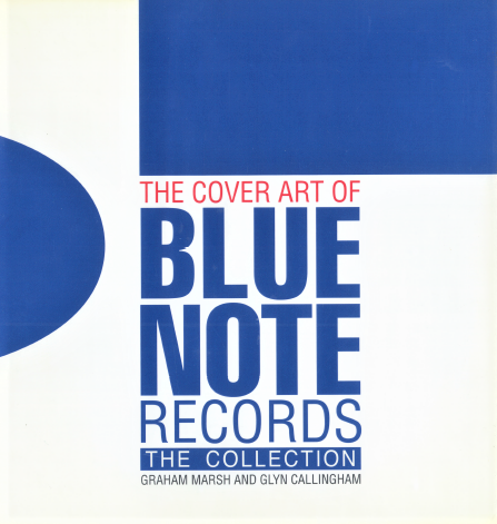
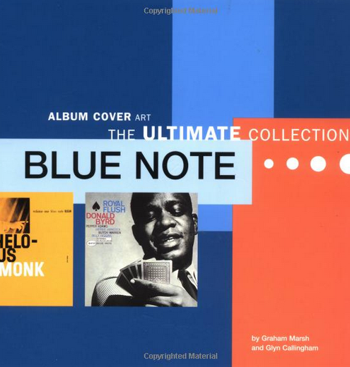
Photos courtesy of Graham Marsh. Two versions of the book are shown: the UK version and the US version.
(c) Debbie Burke
.jpg)
.jpg)
Debbie Burke is a jazz blogger who has interviewed hundreds of jazz musicians from around the globe. She is the author of “GLISSANDO: A story of love, lust and jazz” https://goo.gl/7hTJo5 and “The Poconos in B Flat.” Trained on alto sax at NYC’s New School for Social Research, she now spends her time as the editorial director for a small book publisher in Texas. Visit her blog at www.debbieburkeauthor.com